
Interactive Data Visualization Pertaining to Attitudes Towards Mental Health In The Workplace
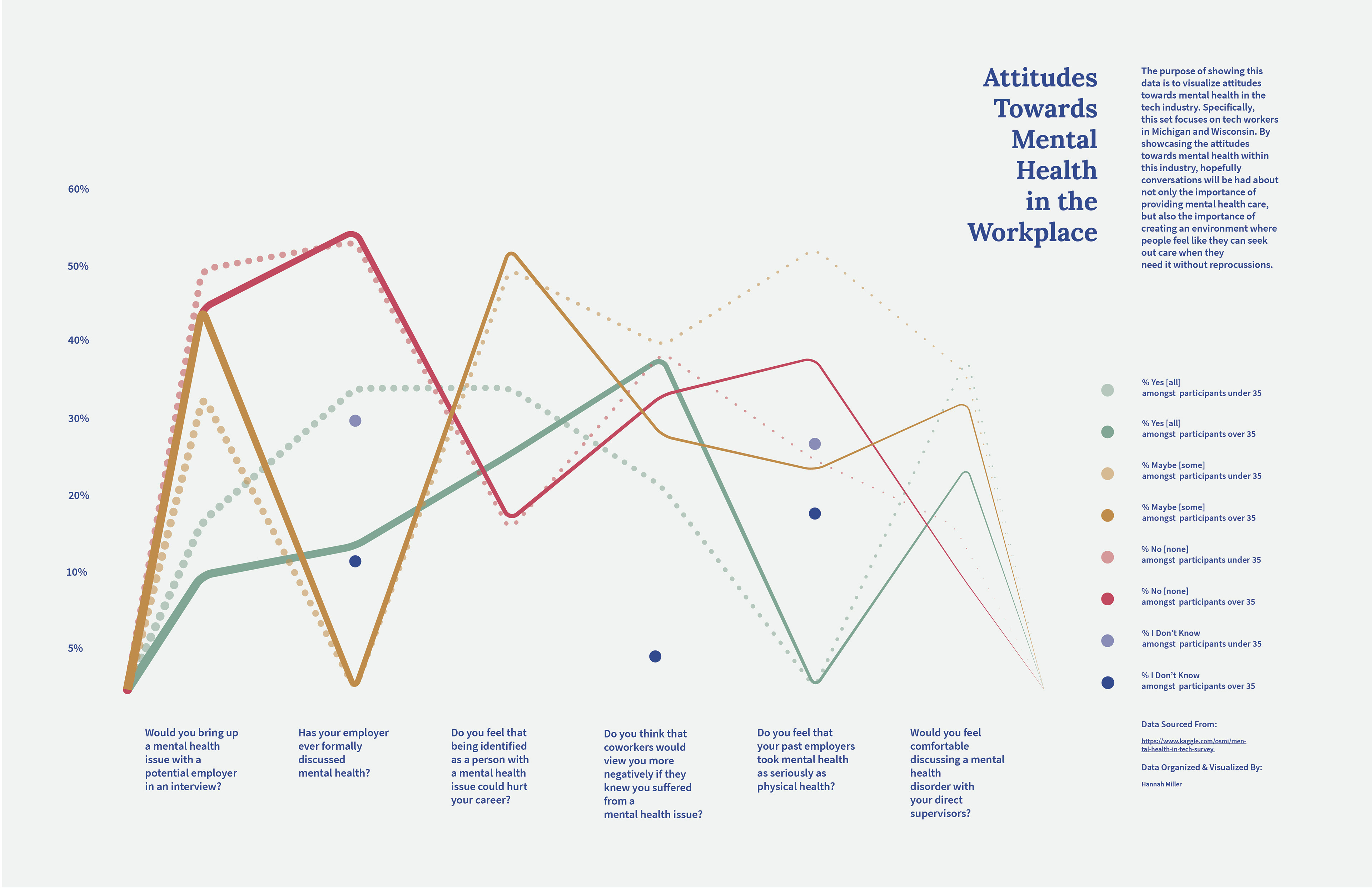
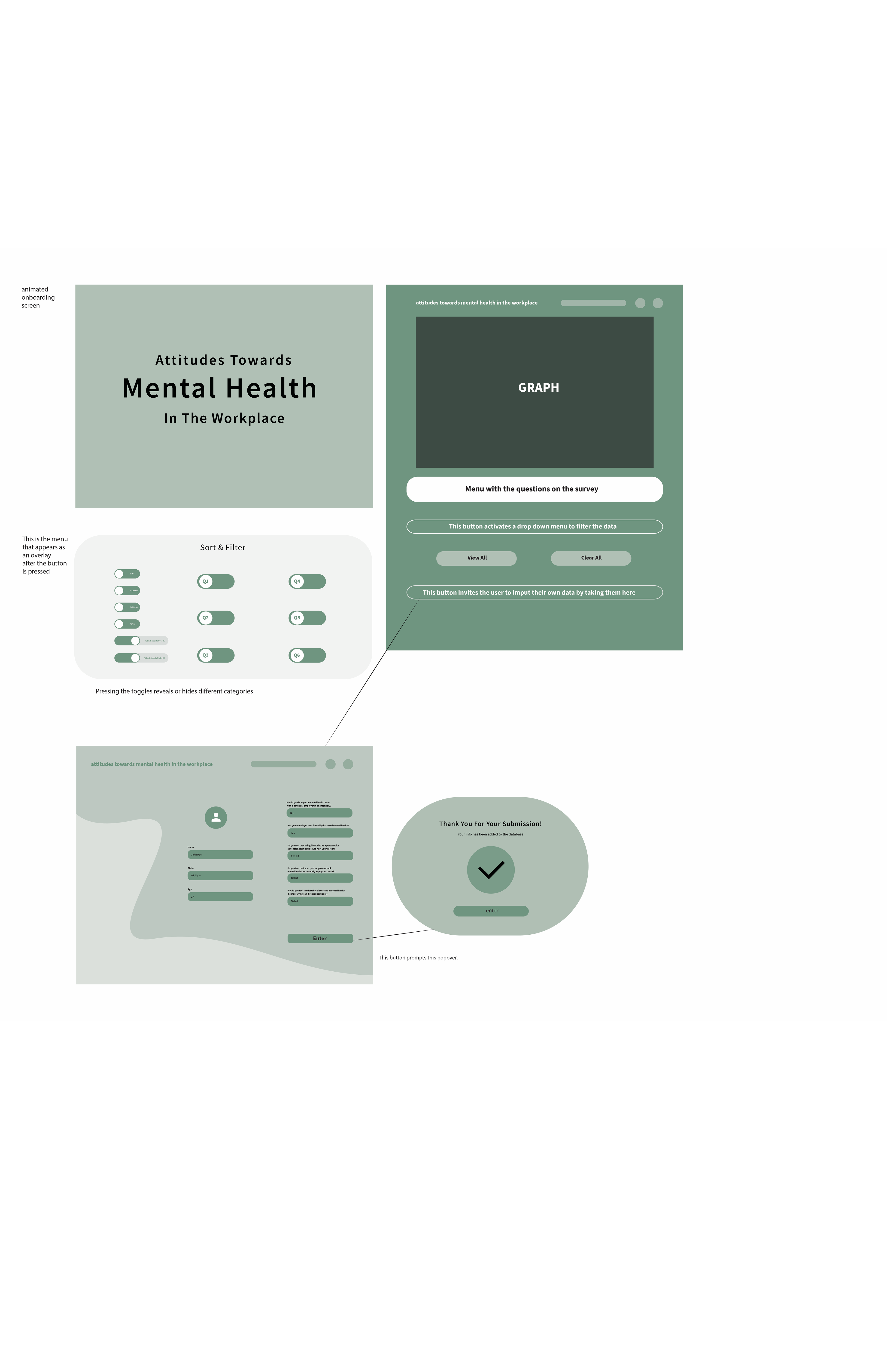
I found a dataset that displayed the results of a survey that deals with stigma towards mental health struggles in the tech industry. Specifically, I focused on the responses from people in Michigan and Wisconsin because that is the area where I'm from and most familiar with. To communicate this data, I created a sample application for the iPad. The data can be sorted by the age of the participant, specific question answered, and how many participants answered yes, no, maybe, or unsure respectively. There is also an option to expand the sample size of the data by inviting the observer to contribute to the data themself- assuming they fall into the appropriate parameters.
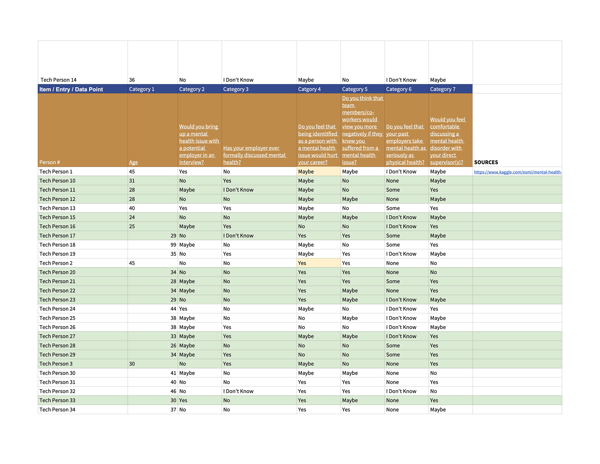
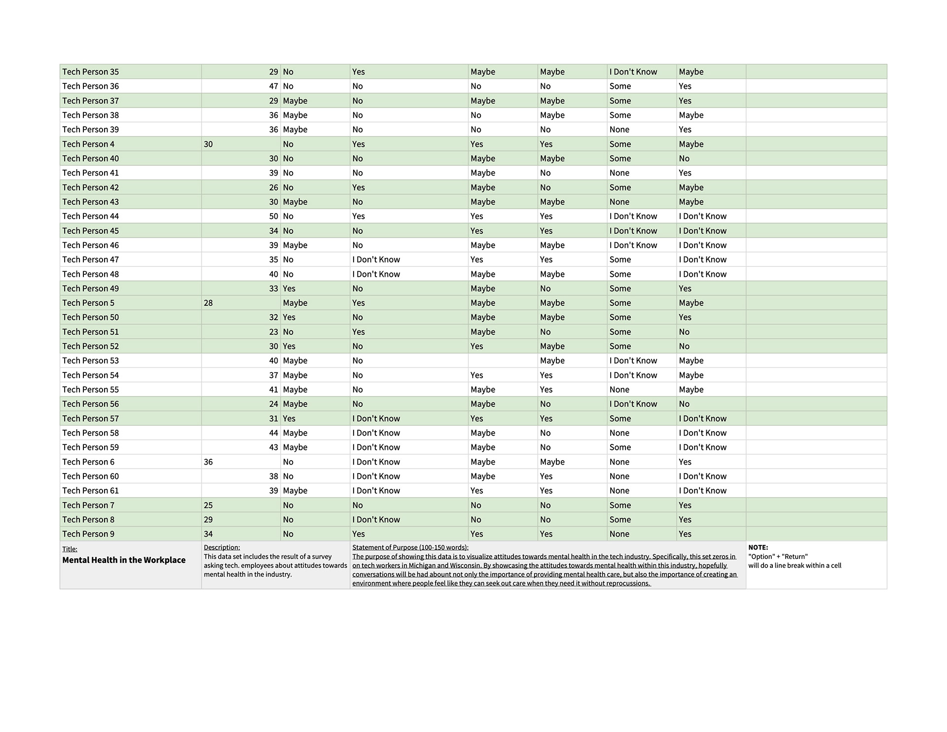
The data was extracted from:
https://www.kaggle.com/osmi/mental-health-in-tech-2016
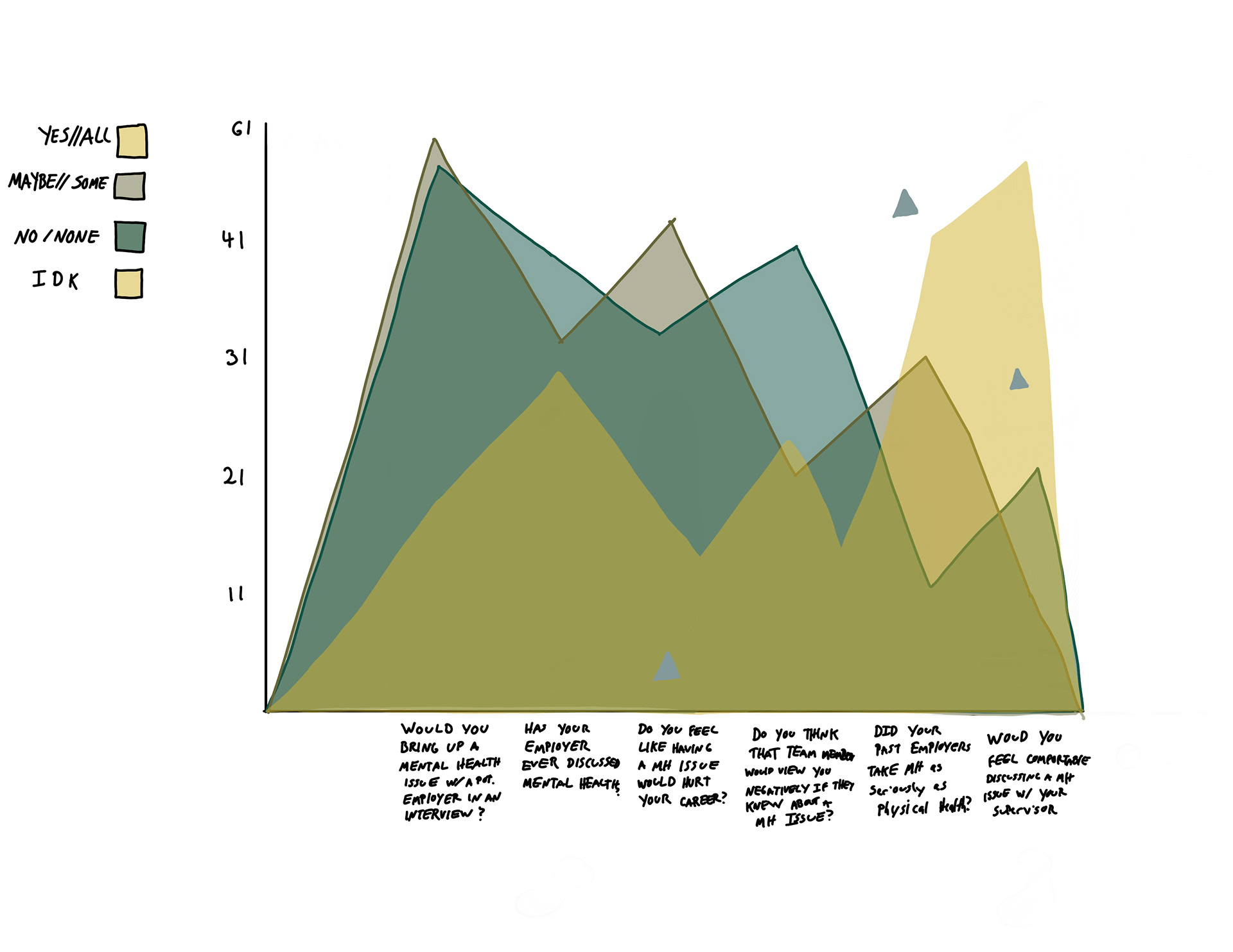
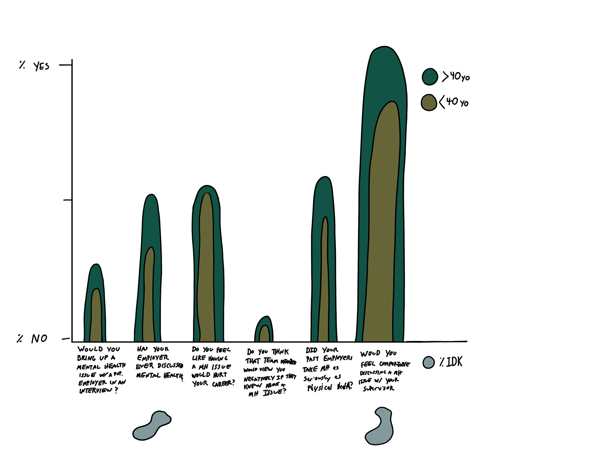
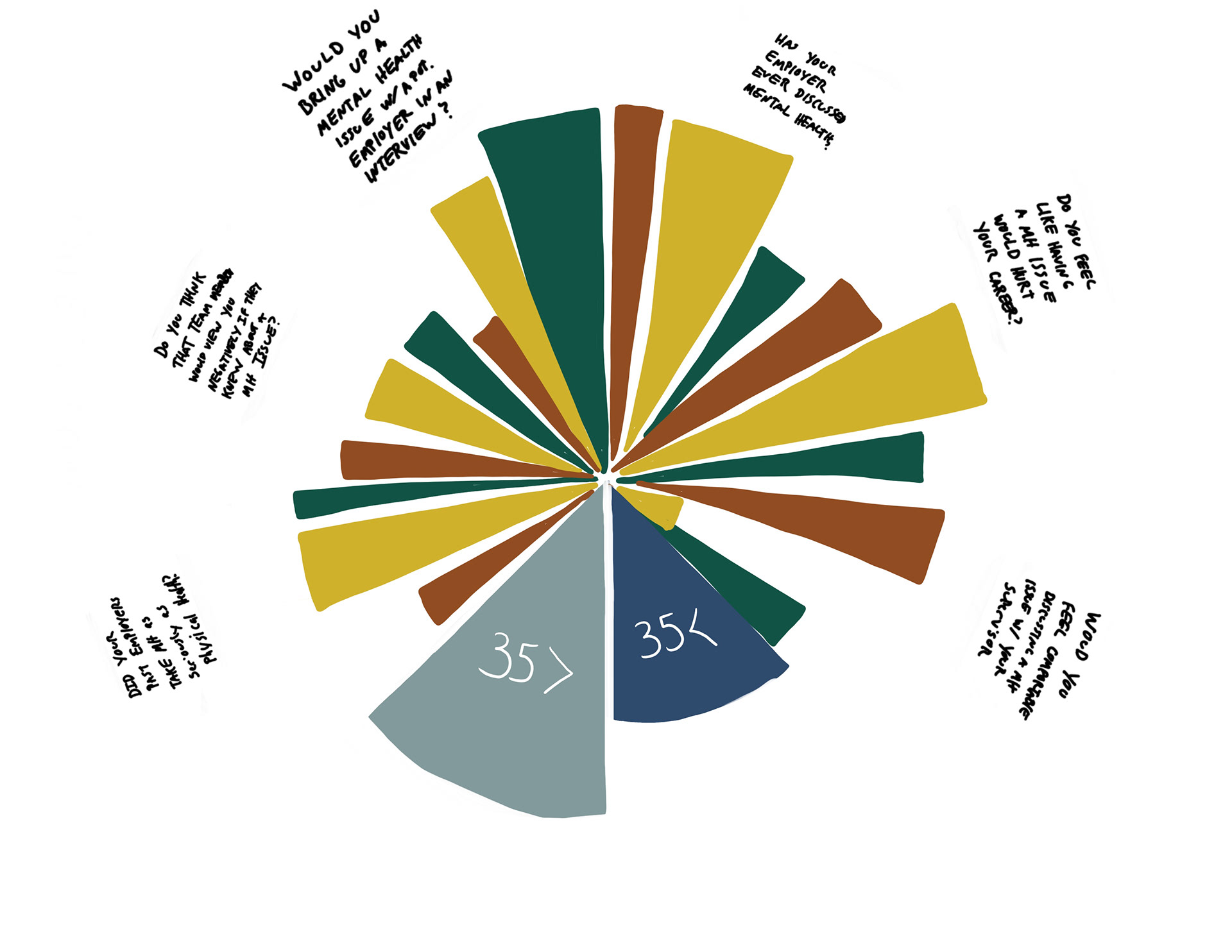
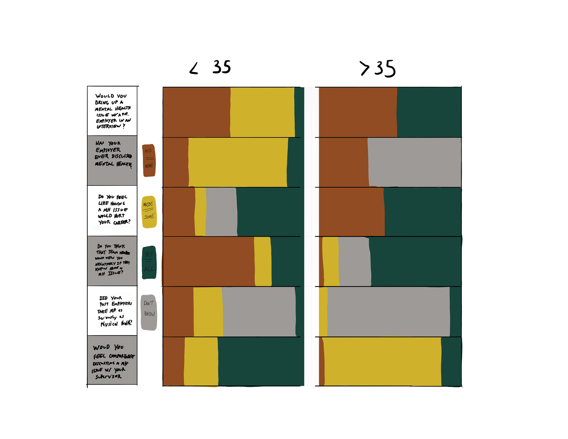
Below are a series of preliminary sketches done in procreate to experiment with different methods of visualizing data in order to tease out which would be the most effective to apply to the final iteration.
Below is a static representation of the dataset as a poster.
After visualizing the data in the form of a static poster, I then created a medium fidelity wireframe for a prospective user to interact with and contribute to.
Lastly, here is an animated prototype of what the final project will look like on an iPad Pro.